How to Choose the Perfect Color Palette for Your Home Decor
By Kalkee Editorial Staff
Updated July 4, 2026 • Verified by Industry Experts
Why a Cohesive Color Palette Matters
One of the most common home decorating mistakes is choosing paint colors and decor items in isolation. A disjointed color scheme makes a house feel chaotic. Developing a unified color palette ensures that each room flows seamlessly into the next, creating a harmonious and polished home decor experience. Whether you prefer neutrals, cool blues, or warm earth tones, choosing a structured palette is the foundation of successful interior design. For those seeking home decor ideas, starting with a cohesive palette is the most effective way to transform your space.
A cohesive color palette also impacts your mood and the perceived size of your rooms. Light, warm neutrals can make a small, dark room feel bright and spacious, while deep, moody colors can create a cozy, intimate den. By understanding color relationships and lighting, you can design a beautiful, flowing color scheme throughout your entire house. Think of your home as a single canvas rather than a collection of separate spaces. When you walk from the entryway into the living room and then into the kitchen, the colors should feel like they belong to the same family. This doesn't mean every room has to be identical, but there should be a thread of consistency that ties everything together. This approach is especially helpful for small living room ideas, where a unified palette can make the area feel larger and more open.
Consider the psychological effects of color as well. Soft blues and greens tend to evoke calmness and tranquility, making them ideal for bedrooms and bathrooms. Warmer tones like beige, taupe, and soft peach can create a welcoming, nurturing atmosphere in living areas. On the other hand, vibrant hues like deep red or bright yellow can energize a space but should be used sparingly to avoid overwhelming the senses. By thoughtfully selecting a palette that aligns with the function of each room, you enhance not only the aesthetic appeal but also the livability of your home. A well-planned color scheme can even increase the resale value of your property, as potential buyers are drawn to spaces that feel intentional and well-maintained.

The 60-30-10 Rule of Interior Design
This classic design rule helps you balance colors in any room. It is a simple yet powerful guideline that ensures no single color dominates too heavily, creating visual interest without chaos. By dividing your color usage into three distinct proportions, you can achieve a professional-looking space that feels both grounded and dynamic. Applying this rule to your living room decor can instantly elevate the overall aesthetic.
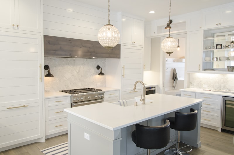
1. 60% Dominant Base Color
This is the primary color of the room, typically used on walls, large area rugs, or main cabinetry. It should be a clean, versatile neutral (such as off-white, warm greige, or soft cream) to anchor the space and reflect light. The base color sets the overall tone and mood of the room. For example, a light, airy base like Benjamin Moore's White Dove can make a room feel open and serene, while a darker base like Sherwin-Williams' Agreeable Gray adds warmth and sophistication. When selecting your base, consider the natural light available. South-facing rooms can handle cooler neutrals, while north-facing rooms benefit from warmer tones to counteract the cooler light. The base color should also complement your flooring, whether it's hardwood, tile, or carpet, to ensure a seamless foundation.
2. 30% Secondary Color
Used for furniture, curtains, accent walls, and side cabinets. This color adds depth and should contrast slightly with the base, utilizing tones like warm oak, navy, slate gray, or charcoal. The secondary color creates visual weight and defines the room's character. For instance, in a living room with a cream base, a navy blue sofa can serve as a striking anchor, while charcoal curtains add a layer of sophistication. When choosing a secondary color, think about the mood you want to create. Cooler secondary colors like blue or green promote relaxation, while warmer tones like rust or olive green add coziness. This layer also allows you to introduce texture through materials like velvet, linen, or leather, which can enhance the overall sensory experience of the space. Incorporating accent wall ideas with your secondary color can create a stunning focal point.
3. 10% Accent Color
Bright or contrasting colors used sparingly on throw pillows, artwork, vases, and accessories. Tones like mustard yellow, terracotta, brushed gold, or copper are perfect for this layer, adding visual interest. Accent colors are the exclamation points of your design. They draw the eye and create focal points, such as a vibrant piece of art above a fireplace or a cluster of colorful cushions on a neutral sofa. The key is restraint; too many accents can dilute their impact and make the room feel busy. Choose one or two accent colors that complement both the base and secondary colors. For example, if your palette is neutral with navy, a pop of mustard yellow or burnt orange can add warmth and energy. Metallic accents like brass or copper can also serve as accents, adding a touch of glamour without overwhelming the space. Small home decor items like printed pillow covers or a statement lampshade are perfect for introducing these accent colors.
How to Test Paint Colors in Your Home
Never choose a paint color based on a store swatch or screen. Paint a large test block on your wall and observe it at different times of day. Natural morning light, afternoon shadows, and warm evening artificial light will drastically change how the color renders. Check how the color looks next to your flooring and main furniture pieces, ensuring that the undertones (warm yellow vs. cool blue) align perfectly across all elements. This step is often overlooked but is critical to avoiding costly mistakes. A color that looks perfect in the store can appear completely different in your home due to factors like the angle of light, the color of your flooring, and even the surrounding decor. For renter friendly decor, testing paint is especially important since you want to ensure the color works with your existing landlord-approved walls.
To test effectively, start by purchasing sample pots of your top two or three color choices. Paint a square of at least 12 by 12 inches on several walls in the room, including one that receives direct sunlight and one that is in shadow. Live with the samples for a few days, observing them in the morning, at noon, in the late afternoon, and under artificial light at night. Take note of how the color changes; some colors may appear more yellow in warm light or more gray in cool light. Also, consider how the color interacts with your existing furnishings. A warm beige might clash with cool-toned gray furniture, while a greige could bridge the gap beautifully. By investing this time upfront, you ensure that the final result is exactly what you envisioned, saving both money and frustration. This process is a key part of any successful modern home decor project.
By testing paint colors in real-world conditions, you avoid costly painting mistakes. A cohesive color palette is the easiest way to make your home feel professional, expensive, and beautifully structured. Additionally, don't forget to test the paint on different surfaces if you're painting trim or cabinets, as the sheen and texture can affect the color's appearance. A matte finish on walls will look different from a semi-gloss on trim, even with the same color. Testing in multiple locations and under various lighting conditions ensures that your entire space works together harmoniously. You can also test how peel and stick wallpaper samples interact with your chosen paint colors for a truly coordinated look.
Developing Flow in Open Concept Homes
In open-concept layouts, creating flow is crucial. Use a consistent neutral base color for all main walls and hallways to tie the rooms together. To define separate zones (like the living area and dining nook), repeat accent colors throughout. For example, use a terracotta vase in the kitchen and repeat that same terracotta color on the living room throw pillows. This visual bridge guides the eye and makes the entire home feel unified. Without careful planning, open-concept spaces can feel disjointed or cavernous. The goal is to create distinct areas that still feel like part of a cohesive whole. Incorporating wall decor like a large wall mirror or an arched mirror can also help reflect light and connect different zones.
One effective strategy is to use area rugs to define zones while keeping the wall color consistent. A large rug in the living area can anchor the seating arrangement, while a smaller rug under the dining table defines the eating space. Choose rugs that share a common color thread, such as a neutral base with accent colors that appear in both rugs. Similarly, furniture placement can help delineate zones without breaking the visual flow. A sofa placed with its back to the dining area creates a natural division, while still allowing the eye to travel across the space. Use lighting to further define zones; a pendant light over the dining table and a floor lamp in the living area create distinct focal points. For a scandinavian living room, this approach emphasizes simplicity and functionality while maintaining a cohesive flow.
Another technique is to carry accent colors from one zone to the next. If you have a blue accent wall in the living room, incorporate blue elements in the kitchen, such as bar stools or a backsplash. This repetition creates a rhythm that guides the eye and reinforces the connection between spaces. Don't forget about vertical elements like artwork or shelving. A gallery wall that spans from the living area into the hallway can serve as a unifying feature. By thoughtfully repeating colors, textures, and materials, you can transform an open-concept layout into a seamless, inviting environment that feels both expansive and intimate. Adding wall art prints or canvas wall art that share a common color scheme can further enhance this visual connection.